Color
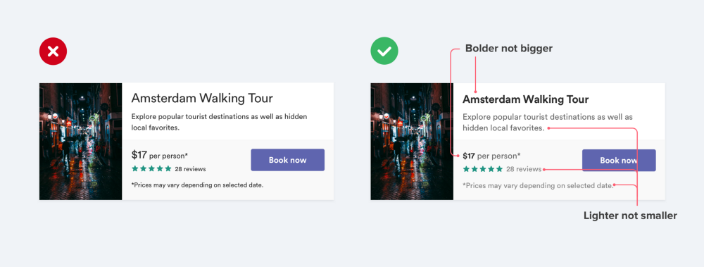
- Use color and weight to create hierarchy instead of size.
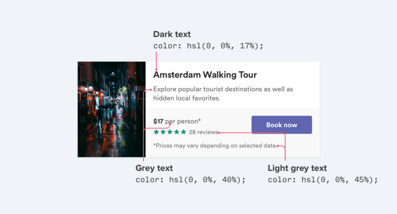
- Never use black. Combine a palette based on a color, from lightest to darkest. I like generate palette colors using palx.
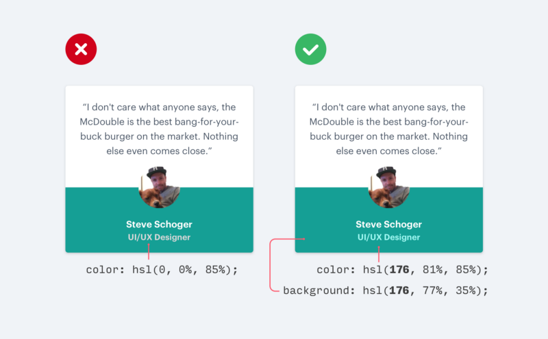
- Don’t use grey text on colored backgrounds. Satinate or opacity are better options. Monochrome is a good tool for do that.
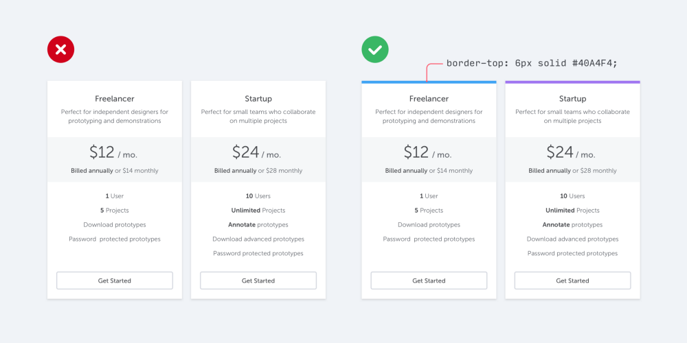
- Use accent colors (for example, at the border) to add color to a bland design.
Motion
- Transitions should be clear, simple, and coherent. Quick. They should avoid doing too much at once.
- On mobile, a transition occur over 300ms. On desktop the value should be around 200ms.
- Transitions that exceed 400ms may feel too slow.
Typography
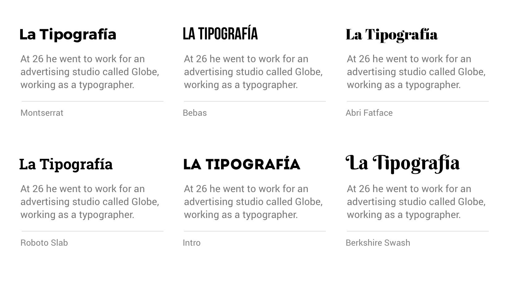
- Choose your typography based on legibility and context.
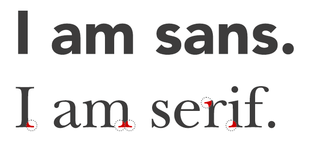
- Two font families are enough for distinguish between heading and body. A common pattern is use Sans Serif and Sans respectively. You can use fontpair for do that.
- Two font weights is usually enough: A normal font weight (400 or 500) and bold (600 or 700) for text you want to emphasize.
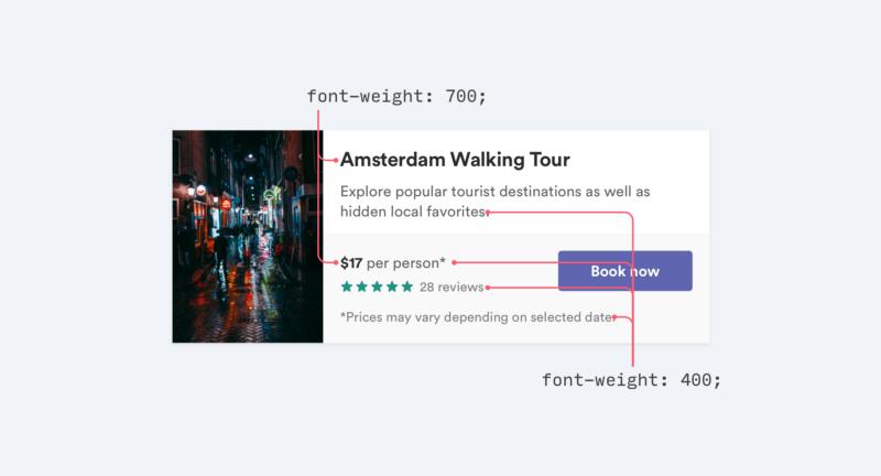
- Font weights under 400 are hard to read.
Shadows
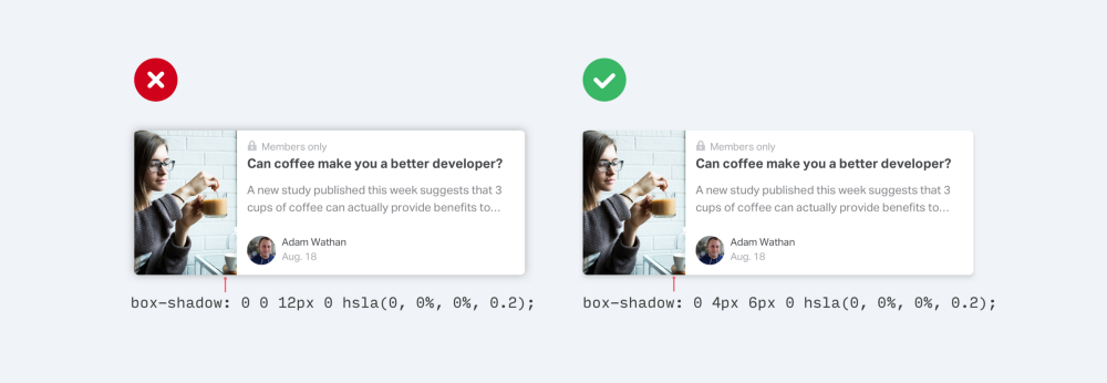
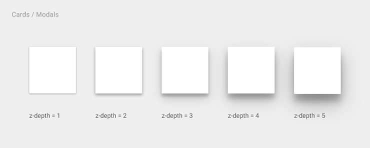
- Instead of using large blur and spread values to make box shadows more noticeable, use subtle and accomplish the same goal without being as distracting.
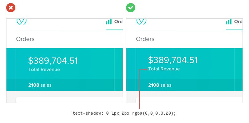
- If you need to use a bright background color, and white text on it, you can put the text a nice subtle shadow to make it more readable.
- Use balance shadows, this means, it looks more natural. Material Design has grateful guidelines.
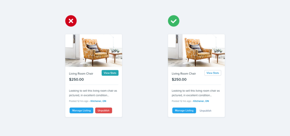
Buttons
- Not every button needs a background color.
-
Primary actions should be obvious. Solid, high contrast background colors work great here.
-
Secondary actions should be clear but not prominent. Outline styles or lower contrast background colors are great options.
-
Tertiary actions should be discoverable but unobtrusive. Styling these actions like links is usually the best approach.