What Does Effective Mean
Any landing page for a digital product should solve the following goals:
- People understand your value proposition.
- The website transmits the message clearly.
- It helps you create new customers.
My experience building them it’s difficult to achieve it because is extremely easy to lose the objectives.
Content is the Key
We tend to focus just on design as differential factor, where a good landing page has a good matching between design and content.
The design is an important factor on landing pages but not the most important.
If you need to do just one thing well, improve your landing page content. Be easy to understand what you want to transmit.
Priorize the Information
Imagine enter a website and you can’t do scroll. The portion of website that you can se is all the information that you can get.
If people only can see the first thing in your website, what do you put there?
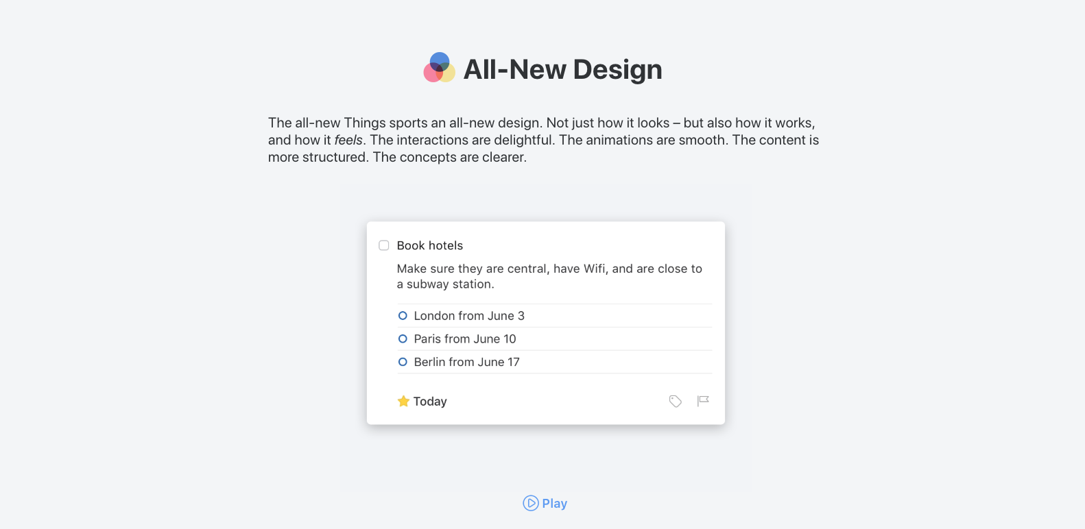
Probably you only can put your main product caption that resume the global vision of the product. You main clap.
The space limits you to being smart: It should be easy to understand for anyone and expressed in a few words.
Then think your mum enter in the website. Can she understand the product?
Really, it should be simple!
This the #1 reason why landing page doesn’t work: People enter in the website, they don’t understand if they need and then they go out.
Find your clap and then you can start building the rest of the website, explaining more information structured in layers, from a high point level of view to more technical things.
The order of question that you need to resolve are what > why > how.
Just One Call to Action
Call to Action (CTA) is a marketing term used for request an user interaction with the website, normally related with the path you want user follows, like subscribe to a newsletter, see pricing table, etc.
Well, it’s a overrated and misused inside a landing page.
As we explain the previous section, our mission as landing page engineers is make things easy to understand and structued the information.
If our mission is to find an internal dialogue with the visitor, what happens if we are trying to get his attention all the time?
Limit yourself in just once CTA per page. You can repeat it along the page, but avoid interrupt your product message: Place it at the start or the end of the website.
If you need to use a different CTA, then create a different page for that.
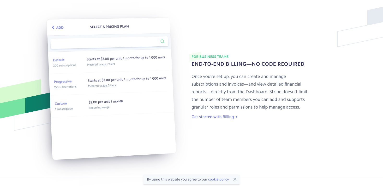
Explain Your Product Showing It
It looks obvious, but most of the landing page is built from a marketing strategy perspective, using assets (like icons) that actually are not part of the product.
Ideally, embed parts of your product into the website. If you can not do it, then you must find the best way to show it.
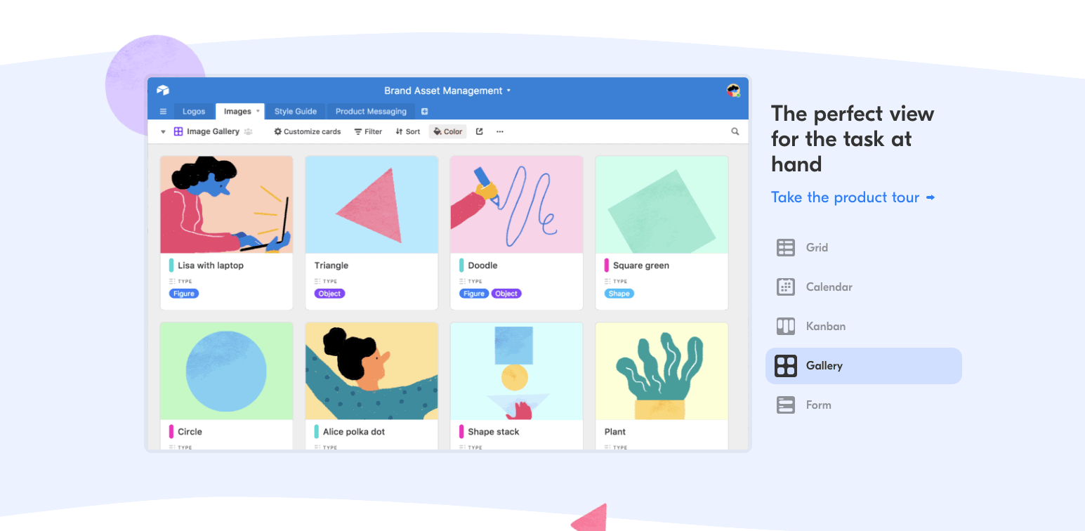
A good parttern to follow here is use one column pattern to explain big functionalities and break it into multi column for small explanations.
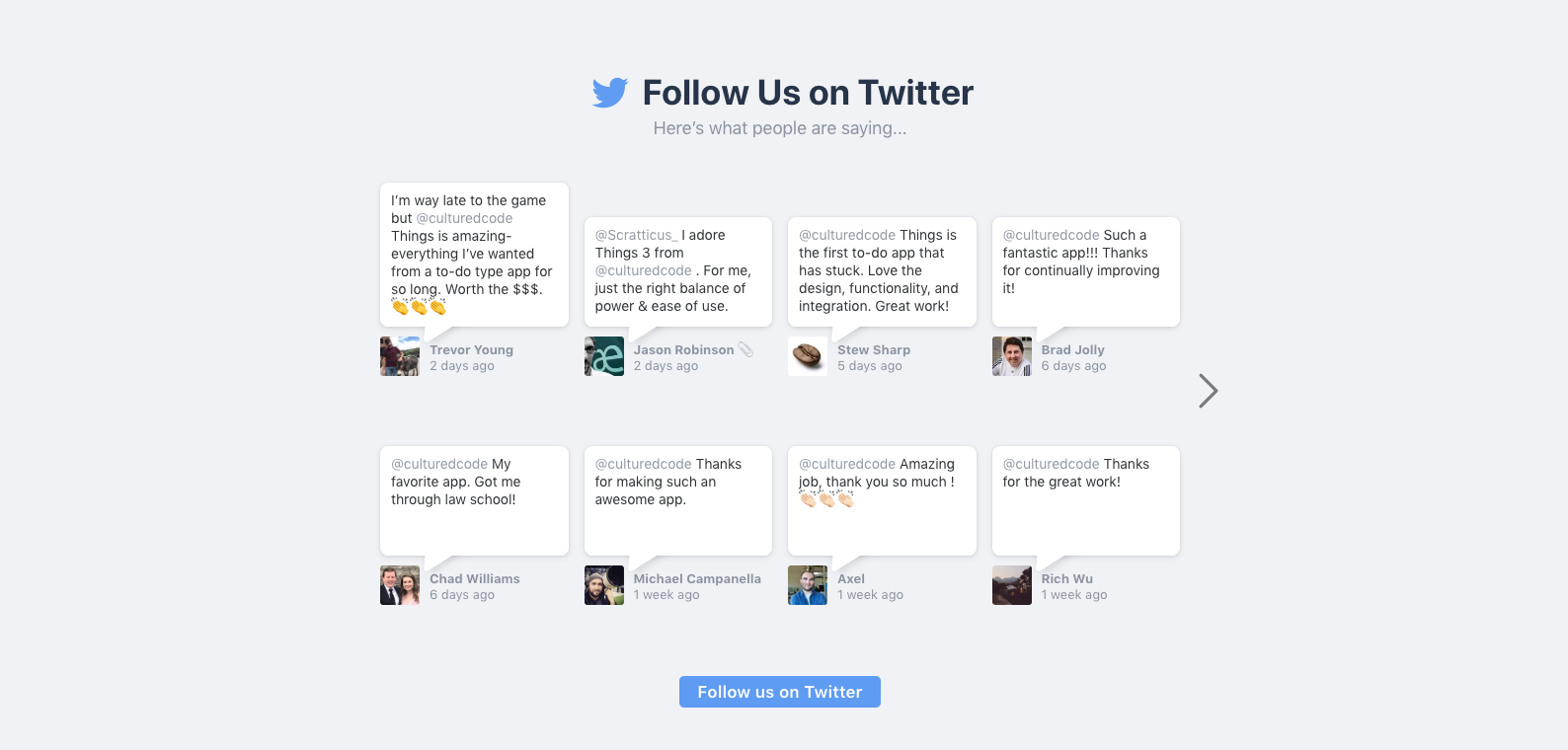
Adding Credibility
Also known as testimonial: It is usually a section where you show your main clients or opinions about your product.
Normally, website show brands logos, like saying “hey, these people use us, you should use us”
Although this is a very common pattern (especially in enterprise product), I feel that you can’t really determinate if those companies are using it, neither how, nor under what conditions.
Instead, I prefer show real feedback for real people.
Bibliography
Focus in First Impression
- authenticweather.com.
- crunchet.com.
- magicsignup.com.
- ghost.org.
- weatherkit.org.
- imgix.com.
- algolia.com.
Focus on Structure
Resources
Design System Components
Logo & Ilustrations
- Open Logos – Free logos for your open source projects.
- unDraw – Free and customizable illustrations.
- DrawKit – Beautiful free illustrations.
User Interaction
- GoodUI.org – Tested A/B Patterns to ouse in your site.
- Common webpage design mistakes by UX Planet.
- Motion design doesn’t have to be hard by Google Design.