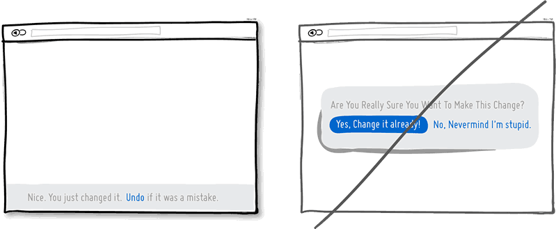
An error should make it obvious how to fix the problem @runarorama
Errors are frustating. In the tech culture, the errors are everywhere all time.
When you design a error situation, think how the user feels under this context. A good error message should be:
- Say what happened and why.
- Suggest a next step.
- Find the right tone.
At the end of the day, errors are part of the product and the business culture for communicating something was wrong.
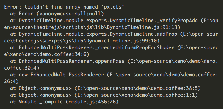
Threy are not only for final user app: We need to communicate good errors message in all your developments layers.
Think in the user experience behind read a developer that looks like:
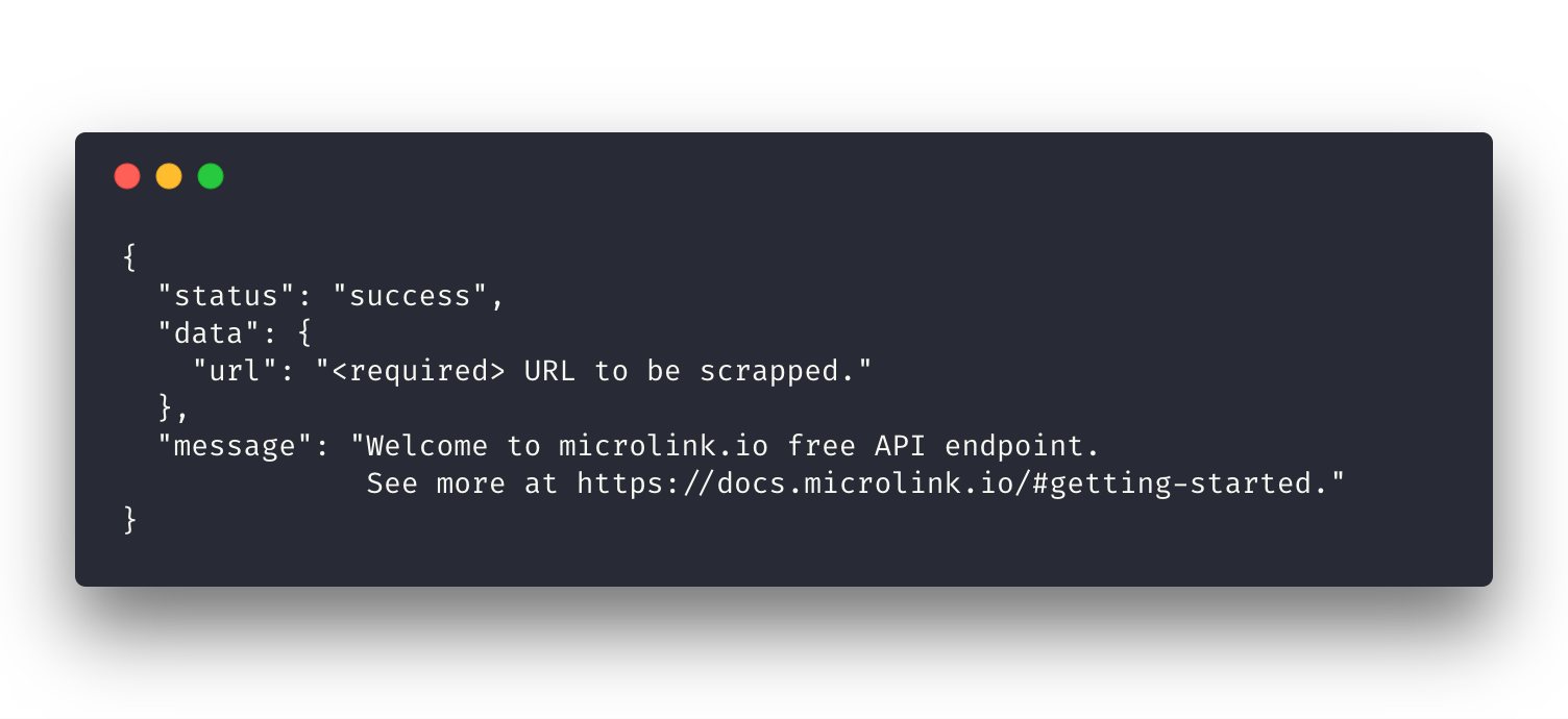
Compare with see the same error with the correct identation and well printed:
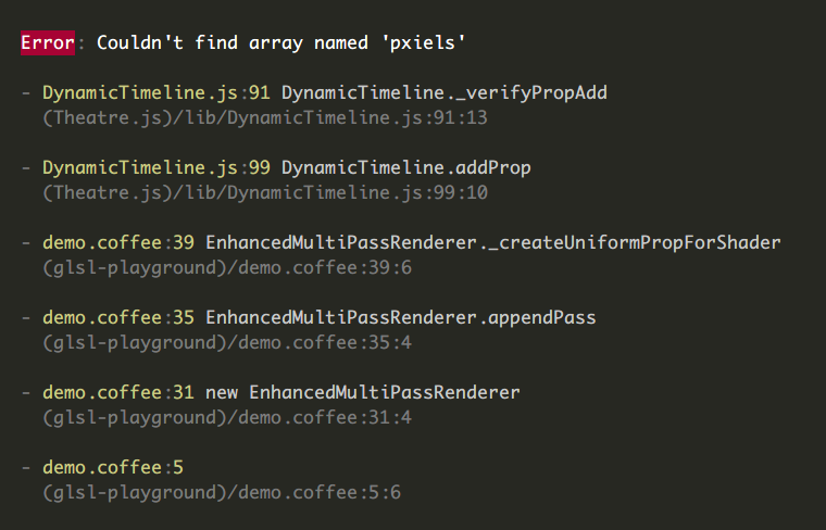
Print good errors is important. Presentation is important. Human eye match is important!
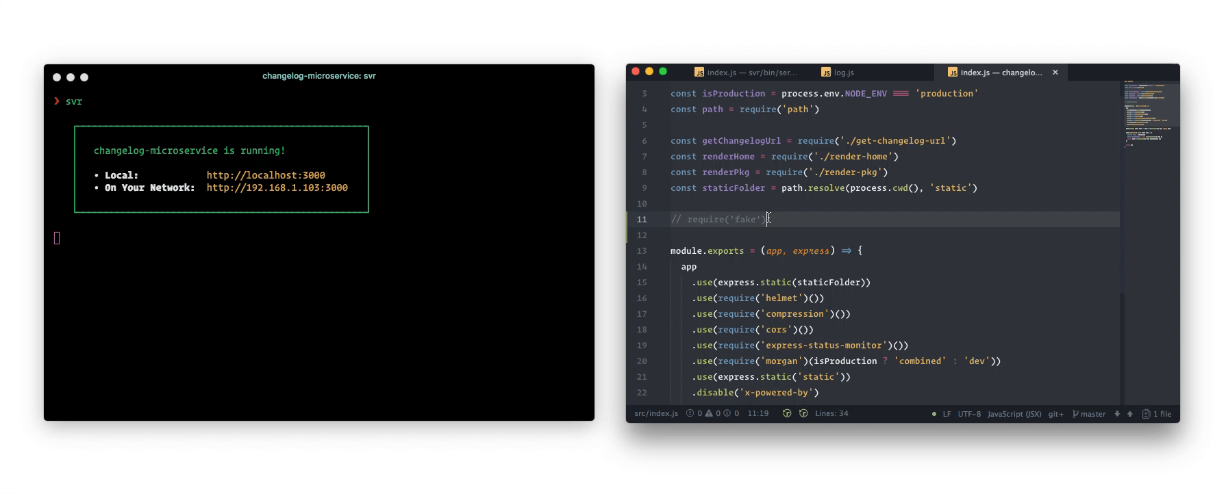
Try to communicate what and why is happening with the less information possible, removing the unnecessary information for the current user abstraction layer.
Always try to provide a point to get more information, making possible extend the context, specially if you are creating collaborative software.
Libraries
- whoops – It makes simple throw qualified errors.
- clean-stack – Clean up error stack traces.
- pretty-error – It prints pretty errors, ideal for CLI tools.
- err-sh – Microservice that forwards you to error messages.